Here is an infographic I was recently sent on the future of libraries created by Open-Site.org

Here is an infographic I was recently sent on the future of libraries created by Open-Site.org
I have been interested in instructional communication and how academics present for some time. My interest began a number of years ago with my love for storytelling and hate for PowerPoint (or should I say the poor use of PowerPoint).
[Note: See below for related works]
I recently came across this video by Hans Rosling. I love his use of technology to tell this story. I was struck by his use of story, inflection, technology… to name a few things. I kept thinking about how this builds on what “weather men” have been doing for years but of course it does so much more.
So is this a new form of presenting? Is this a new form of storytelling? Not necessarily. And it certainly isn’t realistic (at least today) for the common person to tell stories like this. But it is certainly worth a look and serves as some inspiration to do more with technology, storytelling, and presenting!!!
Related Work

There was a recent article on how to turn your Twitter feed into an infographic. Read more about it here.
There was a recent article on how to turn your Twitter feed into an infographic. Read more about it here.

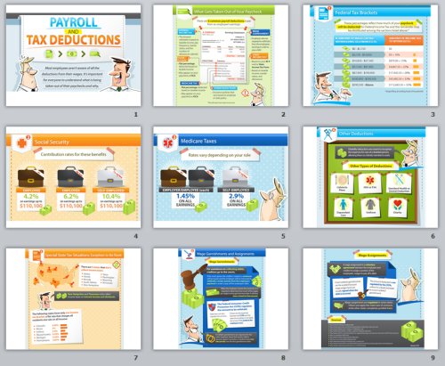
A picture isn’t always worth a 1,000 words but I am a big fan of infographics.
As a result, I have people sending me new one’s every week or so.
I don’t post them all and I realize there are problems with many of them (see this article) but that doesn’t change my love for them.
Check this one out:

And then compare it to this to get an idea of how these are made step-by-step
Social Widgets powered by AB-WebLog.com.